JOICO e-shop UX enhancements
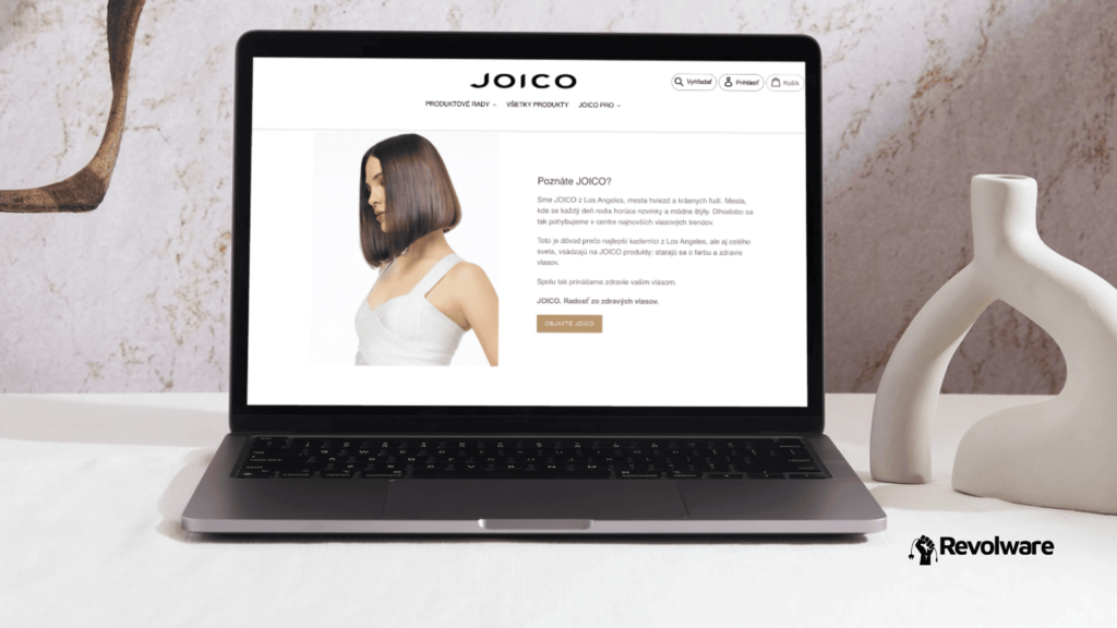
Joico is a premium hair care brand straight out of Los Angeles. They focus on the “Joy of Healthy Hair,” providing professional-grade products that stylists worldwide rely on for color and hair health. And while their products were top-tier, their Shopify store needed a serious UX polish to match that energy and convert casual browsers into loyal fans.
Initial situation
The goal wasn’t just a facelift. It was a Conversion Rate Optimization (CRO) mission. The existing Shopify store had too much friction. Users were getting lost in menus, frustrated by “out of stock” items cluttering the view, and dropping off during the mobile experience. We needed to streamline the path to purchase and make their “Advice” chat feature actually visible.
Scope of work and key areas
- Navigation & UX friction
We focused on making the site feel natural to navigate. If a user has to think too hard, they bounce. What did we do?
Hover vs. Click: We swapped manual clicks for hover-over menus on product lines to speed up browsing.
Visual Hierarchy: Cleaned up the header icons (Search, Account, Cart) and introduced a “sticky menu” so the navigation follows the user as they scroll. We also added a clear “Home” hyperlink because, believe it or not, not everyone knows clicking a logo resets the page. We optimalized cookie banners view, so that it would not interfere with contact button. - Conversion & stock management
Nothing kills a shopping mood like clicking a “Best Seller” only to see it’s sold out. So by Smart Filtering, we reconfigured the “Most Popular” section to automatically hide out-of-stock items or replace them with available alternatives. To boost conversions and campaing effectivity, we added “Add to Cart” buttons directly under products in the grid view, cutting out unnecessary clicks. Also implemented a scrolling “Free Shipping over 50€” bar to keep the incentive of this Joico campaign front and center. Availability date of sold-out products was also added, for users to know when their favourites will be in stock again. - Mobile-first optimization
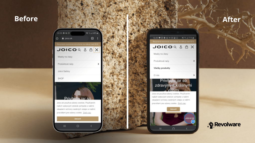
Since most traffic comes from phones, we treated mobile as the priority: the original logo was massive and hogged screen real estate, so we optimized the layout and exported a leaner, cleaner version. We also reordered the mobile footer to put the newsletter signup first, capturing leads more effectively. Specifically on mobile version, the cookie banner was literally burying the “Advice” chat icon. We repositioned it and adjusted opacity so users could actually see they had support. We also implemented resizing of contact elements according customer device type. - The Checkout Funnel
We wanted the cart to feel like a “3-step breeze”, to support psychological 1-2-3 rule, instead of more steps in the original cart. Alongside this, we used contrasting colors to separate button actions to clear directions for shoppers. To boost sales, we added “Certainty” messaging (e.g., “Delivery in 2-4 days”, “Easy returns”) at the exact moment users usually get cold feet.
And the Results?
The data speaks for itself. By removing friction and emphasizing the brand’s professional identity, we saw a massive jump in engagement:
- Add to Cart Rate: Increased by 38%
- Conversion Rate: Grew by 9% overall
- Retention: 23% more customers returned to shop compared to the same period the previous year.
The Joico eshop transitioned from a standard template to a high-performing sales engine. By focusing on small “quality of life” improvements, we made the shopping experience as smooth as the hair products they sell.
Do you want to enhance journey of your customers?
Contact us via our form and let’s collaborate!