Baanthai.sk
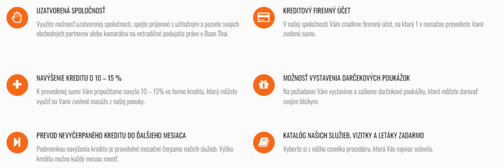
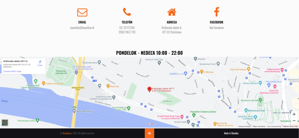
We have produced a landing page for the client Baanthai, a Thai massage studio located in Bratislava. The website was primarily used by Slovak-speaking customers. English speakers saw an automated hint to call the center directly with their clickable english reception phone number.
The website redesign required a prior analysis of user interaction. We have deployed Google Analytics to watch common user behavior on the original version of the website for a period of 10 days. Based on this data, we have presented the client with a goal list for the redesign. The list included:
- Faster orientation for first-time customers
- Clear pricing list and order options
- Shorter texts
- Unification of the design
Faster orientation for first time customers was achieved by clearing the sections and website structure. We developed the website in iterative cycles. Firstly, sections of the website were reorganized and common user behavior on the website was observed. Based on the results, we have deployed a new version, changing the things that were still confusing the users.
Making the pricing list clearer also challenged our business consulting skills. Based on the most popular combinations of massage treatments, we have created service packages with custom additional options. Our concept proved to encourage more users to book massages as well as helped the center to provide services more efficiently.
Moreover, we made texts on the website up to 5 times shorter without giving up too much content or essential information. The section designs and newly created packages were then connected in one, unified website design. The Baanthai massage center doubled web orders after deployment of the redesigned website.


In summary, our redesign achieved these results:
| 2x | 85% | 15% |
| more web orders | decrease in calls asking for directions | revenue increase of the center |
Let’s boost your business with high quality website.
Tell us about yourself and your plans here.