Reducing food waste with Wasteno
App development • Website development • UX/UI • Consulting
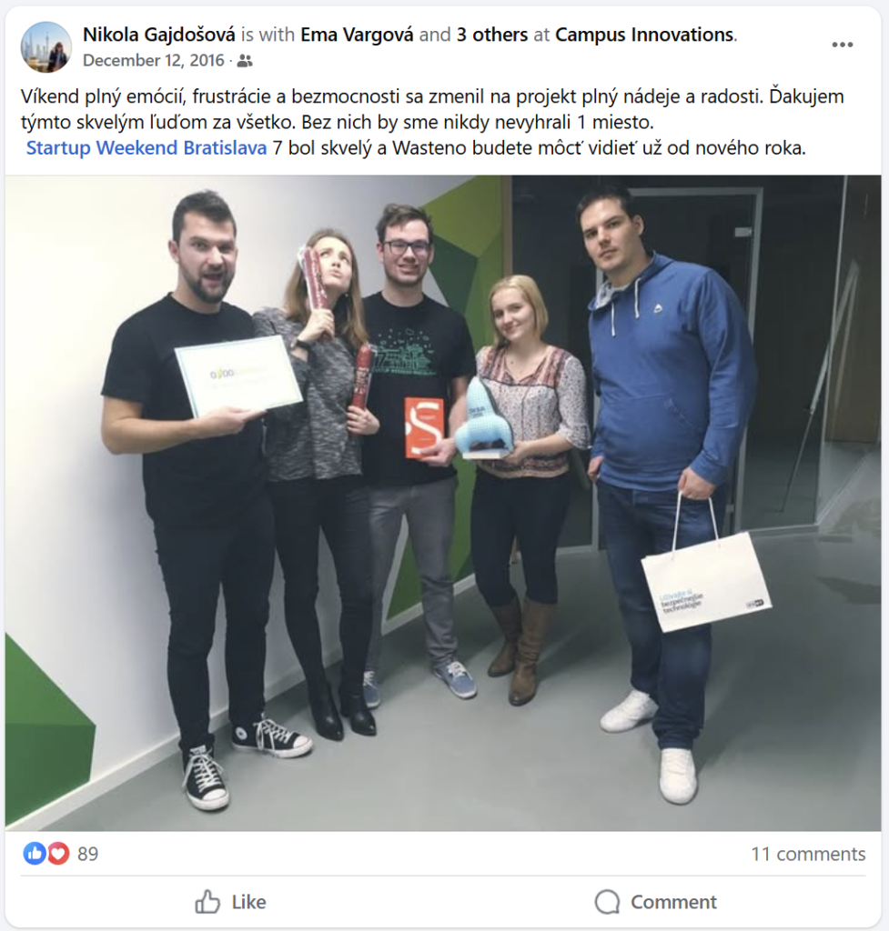
Wasteno is a Slovak non-profit organization focused on reducing food waste in supermarkets. Their concept was first introduced at Startup Weekend Bratislava, where they highlighted the urgent issue of one-third of global food going to waste. Recognizing how much unsold food supermarkets discard, Wasteno proposed a system to redirect those items – still safe but nearing expiration – to social facilities in need. Their first collaboration began with Billa supermarket.
Challenges
Wasteno had a strong mission and concept, but they struggled to communicate it clearly and attract new users through their digital platforms. Their website lacked structure, consistent UX messaging, visual coherence and clear navigation – making it difficult for users to understand the offering or take action. Text content was vague, fonts and colors were inconsistent, and imagery didn’t always reflect the intended message. As a result, user engagement remained low.
Short summary of key tasks
- Design system for Wasteno’s brand
- Website
- Mobile App
Solution
We stepped in to redesign Wasteno’s website and develop a companion mobile app – both aligned with their original identity but updated for clarity, accessibility, and user engagement.
Website
- Streamlined layout with defined design system
- Clearer UX writing to help users connect emotionally and practically
- Visually balanced sections for easier navigation
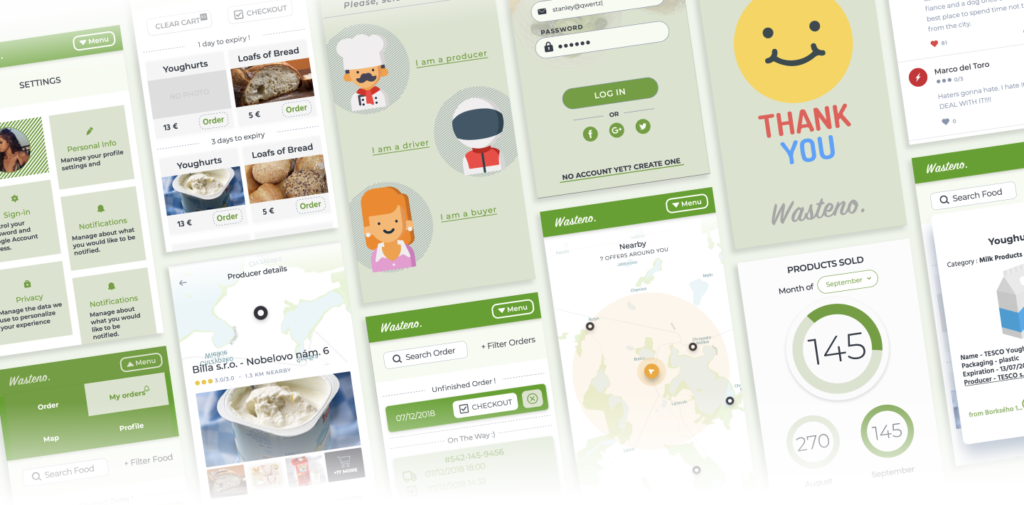
Mobile App
- Role-based user onboarding (Producer / Driver / Buyer)
- Map functionality to view offers by location
- Delivery and pickup tracking features
- Seller dashboard with infographics on product and buyer data
Our Process
Website
We began by analyzing the existing website to identify pain points:
- Unclear UX copy and emotional disconnect
- Disorganized layout that overwhelmed users
- Inconsistent visuals that diluted Wasteno’s identity
We then created a design system, revising the typography, spacing, and visual hierarchy to ensure better readability and adaptability across languages. Content was rewritten for clarity, tone, and user connection.
We also restructured sections to break up dense information, added whitespace for breathing room, and ensured the site reflected the core values of sustainability and social impact.
Mobile App
Recognizing how many users rely on mobile access, we proposed an app that could simplify user engagement and expand Wasteno’s impact. Our process included:
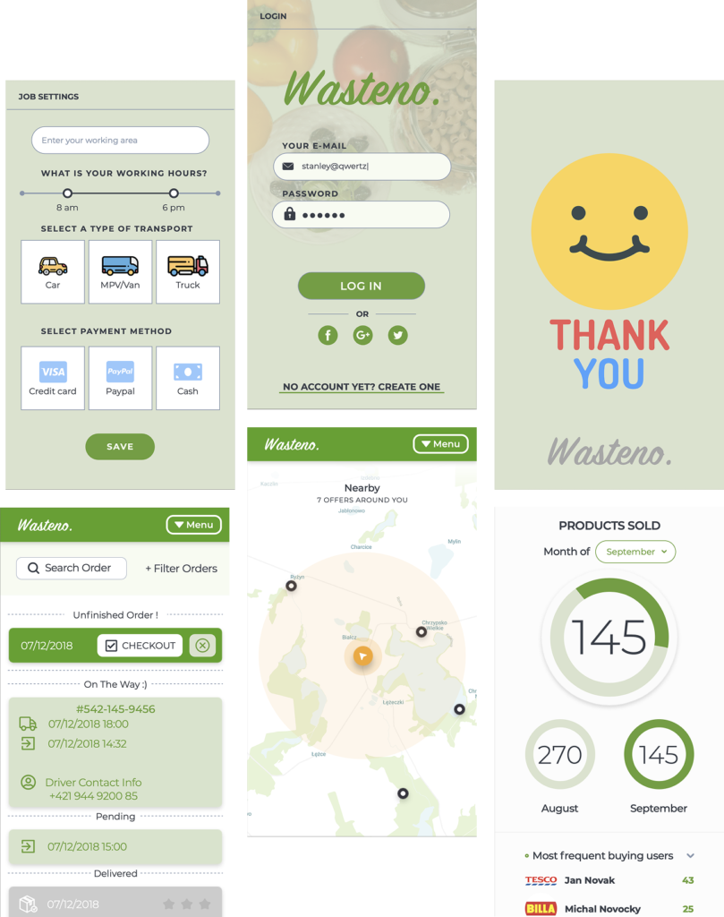
- Defining user roles (Producer, Driver, Buyer) to tailor the experience to different needs
- Brainstorming and testing navigation flows for ease of use
- Iterating through map layouts until we found one that balanced utility and visual clarity
- Prioritizing delivery tracking, allowing users to see order status and contact drivers if needed
- Designing for pickup spot information (address, distance, order weight) and creating a dashboard for sellers showing insights into product stats and buyer behavior
- For sellers: a built-in infographic dashboard that visualizes key statistics (e.g., sales by month, top buyers).
Based on early user testing and internal discussion, we realized a visual browsing tool would be more effective than search alone. We brainstormed several layouts for the map feature, prioritizing clarity and location relevance. After a few iterations, we landed on a minimal layout that clearly shows nearby food sources.
Impact
With the redesigned website and newly introduced mobile app, Wasteno now has the tools to communicate their mission clearly, increase user engagement, and help reduce food waste more effectively. The platform makes it easy for both individuals and organizations to reduce food waste and contribute to a more sustainable system – all with just a few clicks.