Fashion Map Slovakia
Slovak Fashion Council is a non-profit organization with a mission to support and develop Slovakian fashion industry. Their newest idea on elevating Slovakian fashion was to create a fashion map that would represent Slovakian culture and show designer’s pieces to anyone interested.
Goal
Create an interactive multiplatform map that would introduce Slovakian fashion, designers and culture to the public.
Revolware represents the youngest generation of mobile app developers. In 2017, Slovak Fashion Council was searching for a supplier to execute our vision of a digital fashion map. We compared multiple offers and Revolware offered the cost-benefit ratio. The application was created in cooperation, developers offered us with continuous service and consultations which helped us understand the best industry practices and improve functionalities of our app. We also value mutual understanding of the payment conditions, as finances in our non-profit organizations are planned for long runs. Revolware secured the technical necessities which helps us focus on our primary goals without the need to solve problems outside of our expertise. Pro-client approach of Revolware enabled us to dispose a mobile app with a huge potential for the future. The app therefore became an active part of both our portfolios. Recommended, thank you Revolware!
Zuzana Bobikova, managing director at Slovak Fashion Council
Solution
Phase1: Meetings, Research, planning
When we first met up with the SFC team they knew exactly what they wanted. They already created physical version of the map that was raising awareness of the Slovakian fashion brands. Now they were looking to expand their project by building and interactive android based version of the map. Prior to the first meeting we expected a team of top-notch uncompromising clothes designers but to our surprise we were welcomed by a charming group of IT guys with a sense for fashion.
As always, we first thoroughly discussed their project’s aim and desired outcomes to ensure that multiplatform map really is the best solution for their situation. In the end there was not much work for us left in this regard. SFC already tested the map in its physical form and all the metrics from previous campaign suggested that a multiplatform app really is the best way to engage wider public in Slovakian fashion. The main reasons for this were:
- The app is easier and faster way to spread the map among large numbers of people on different platforms
- New places and shops can be added in the future
Finally, we put together functional specification and our team started to code Slovakian fashion map.
Phase 2: Features and Design
Access
In order to properly engage all types of possible users we implemented 3 types of access by which they can access the fashion map.
- Logging in / Registering as a regular user by manual registration or Facebook synchronization
- Logging in / Registering as a fashion shop or event
- Only accessing the fashion map without the need to log in or register
These types of access allow for tourists to easily interact with the map and discover different fashion shops to their heart’s desires. At the same it allows users who want to keep up with the newest events, shops or save their favorite locations. Lastly it allows shops and various fashion events to register in the app and be put on the fashion map after SFC’s approval.
Filters and Locations
The need for good filtering options in the app was very clear from the beginning. It is one of the significant features of the app where the digital version shines through. Filtering options include different categories of shops and events, dates for fashion events and specific hashtags.
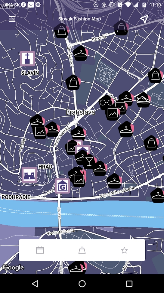
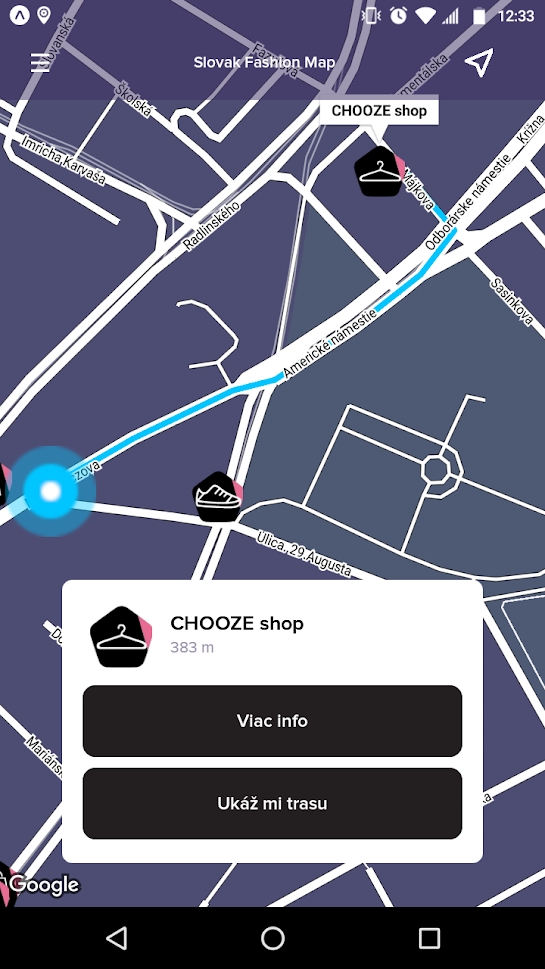
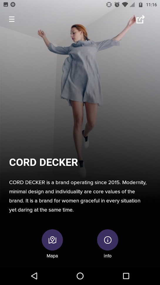
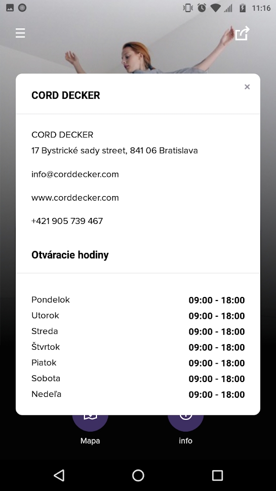
The users are also able to see their live location and the types of opportunities around them. Unique markers for shops, events and suggested places were implemented for better orientation. Each of the locations has a pop-up option. Users can click on a marker and view short info or read full characteristics of the spot.
Design
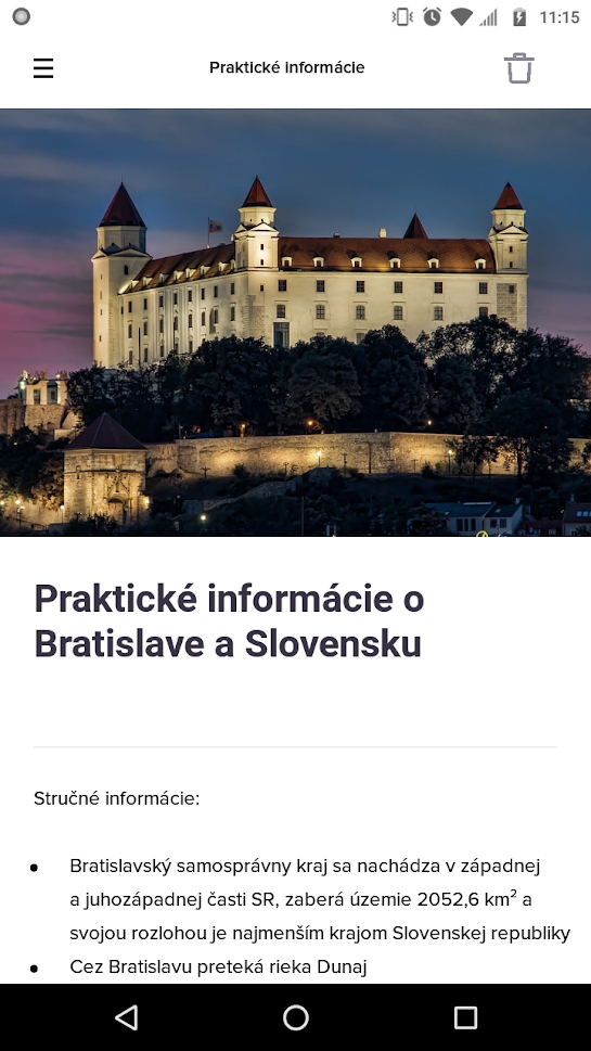
Similar to the paper version of the map, we agreed to use purple dominant color palette. White and black for functional aspects of the app and Proxima Nova font that best complemented our designs.
Phase 3: Testing
Functionality, Performance, Integration, Database and Security tests
In house test cases performed by our developers and testers.
User Interface and Usability tests
We used a focus group with the mix of iOS and Android devices. This testing led to several improvements for better usability of the app. One of the important findings was that users preferred to go back to menu after clicking on menu items instead of returning to the fashion map display.
Phase 4: Summary
To sum it up, these are the critical metrics that sum up our development process and workflow on the digital version of Slovakian Fashion map. The map was mentioned in NY times:
Long Overlooked, Bratislava Shines With Newfound Cool
Available on
Google play: https://play.google.com/store/apps/details?id=com.revolware.sfc
Apple app store: https://apps.apple.com/app/id1482544493
Ready for your own mapping app?
Contact us here.
